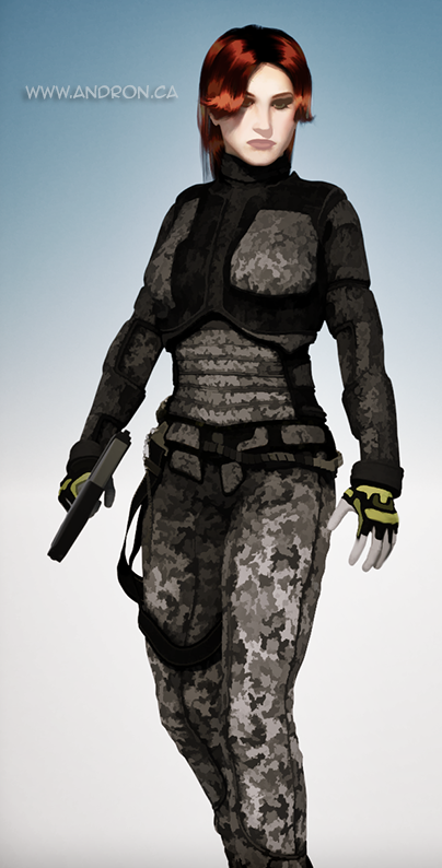
 As I mentioned in an earlier post on Animation, I do work with computer graphics and artwork. While I mainly focus on animation, I do sometimes dabble with still images and trying to reproduce a certain look and feel through programs like Adobe’s Photoshop. One of my particular challenges has been trying to reproduce the look of traditional hand-painted artwork from a 3D render.
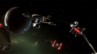
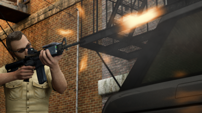
As you can see from the image at the left, I’ve made a bit of progress in that regard. There’s still more progress that can be done on this image, but it has to my eye managed to capture the feel of a hand-painted image.
I spent a lot of time looking at paintings and trying to understand how the colors shifted and blended together to replicate the look of a painted work. A photograph or digital render will have smooth gradations in color from light to dark, while a painting will have distinct islands of colors blended together at the edges by smearing. Too much blending, and you start to approach the look of a photograph. Too little, and it looks computer generated or computer processed. Just like in the story of Goldilocks, a lot depends on getting things “just right.”
I’m looking at using techniques like this for, among other things, book covers – to get the look and feel of classic pulp and paperback covers.
Why not just hire an artist to paint something for me? Because then I wouldn’t have the fun of doing it myself. And a large part of writing, telling stories, and creating heroic worlds is having fun. It’s way too easy to lose sight of that when you get into production mode and just want to treat books and media as simply products. You’re allowed to have fun doing what you do – and solving challenges with how to get artwork to look a certain way is where I get to have a lot of fun.
Let me know what you think below.
